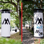
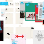
— print control

Archive
identity

YOPE_Visual_6_MydlaTGA_PL_2016-10-26-1173x821 Screen Shot 2019-01-07 at 18.09.17 Screen Shot 2019-01-07 at 18.09.43project YOPE
design Paweł Piotr Przybył
format various
typeface Fira Mono, Plakkatta, Local Market Script
paper uncoated, structured 
print run 10 000 / product
client YOPE
year 2015–2017
link www.yope.me

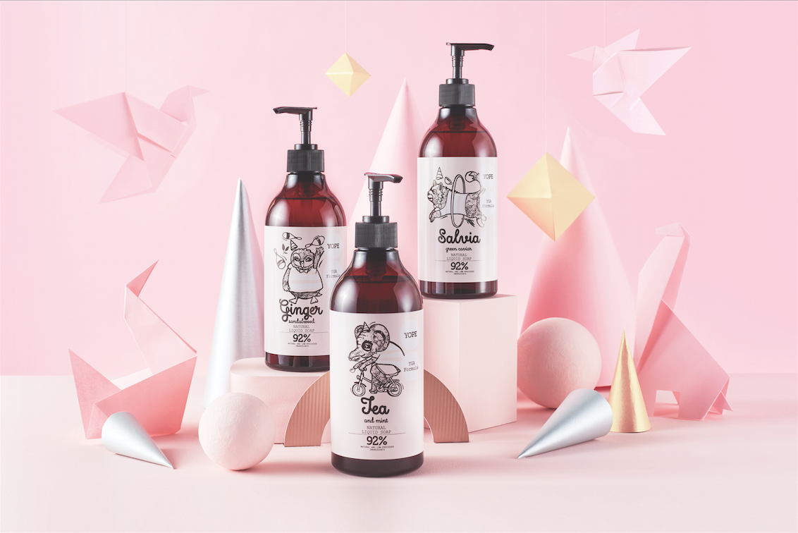
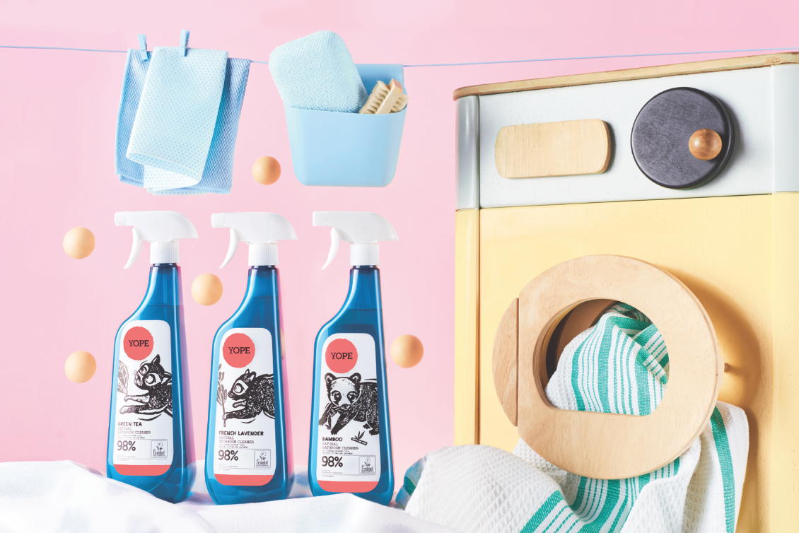
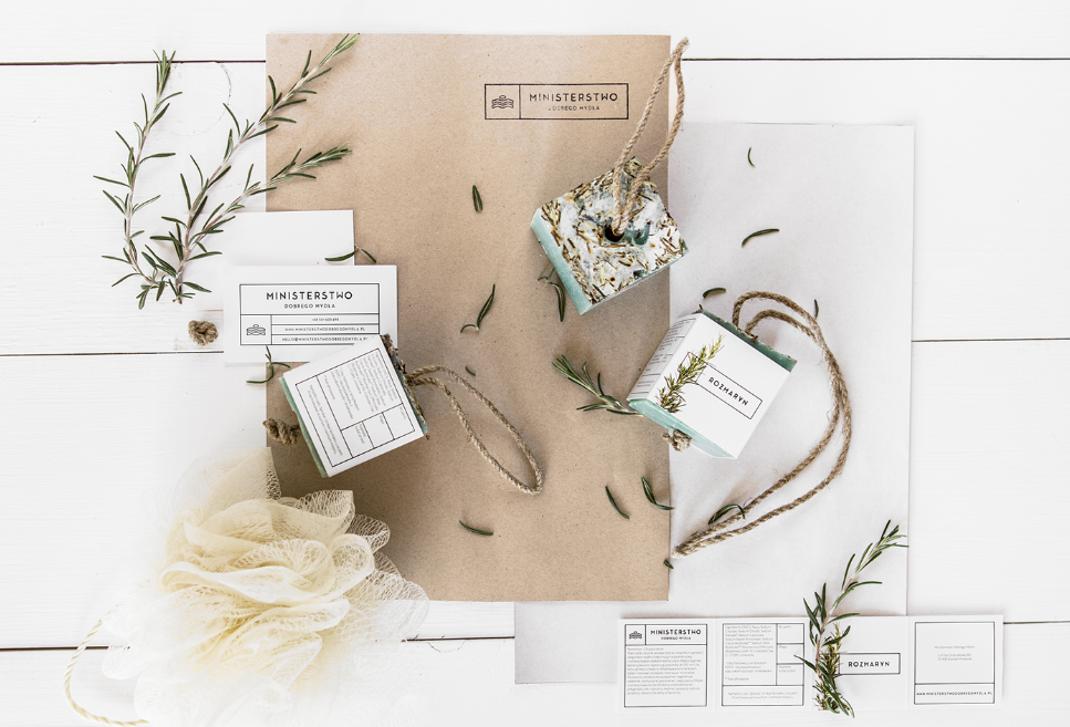
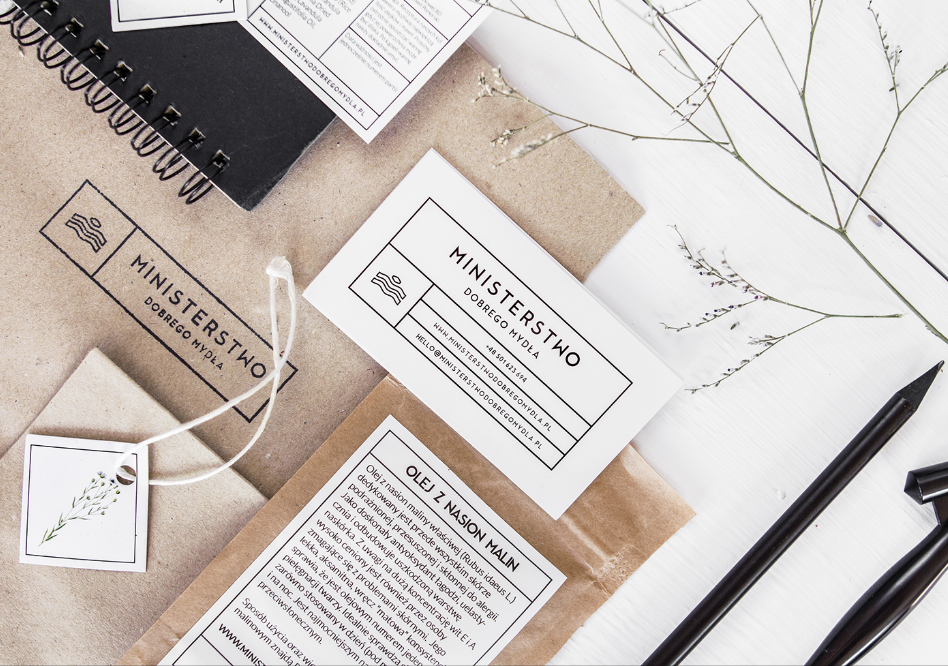
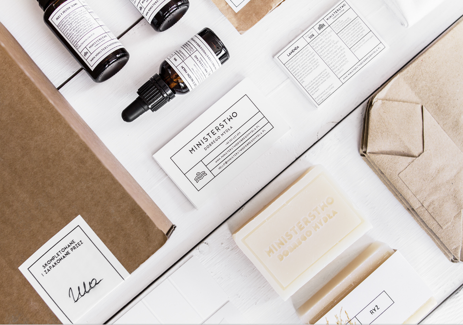
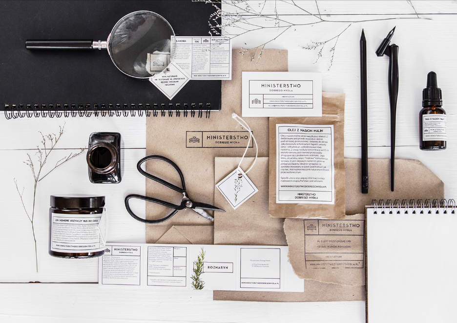
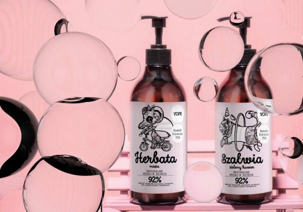
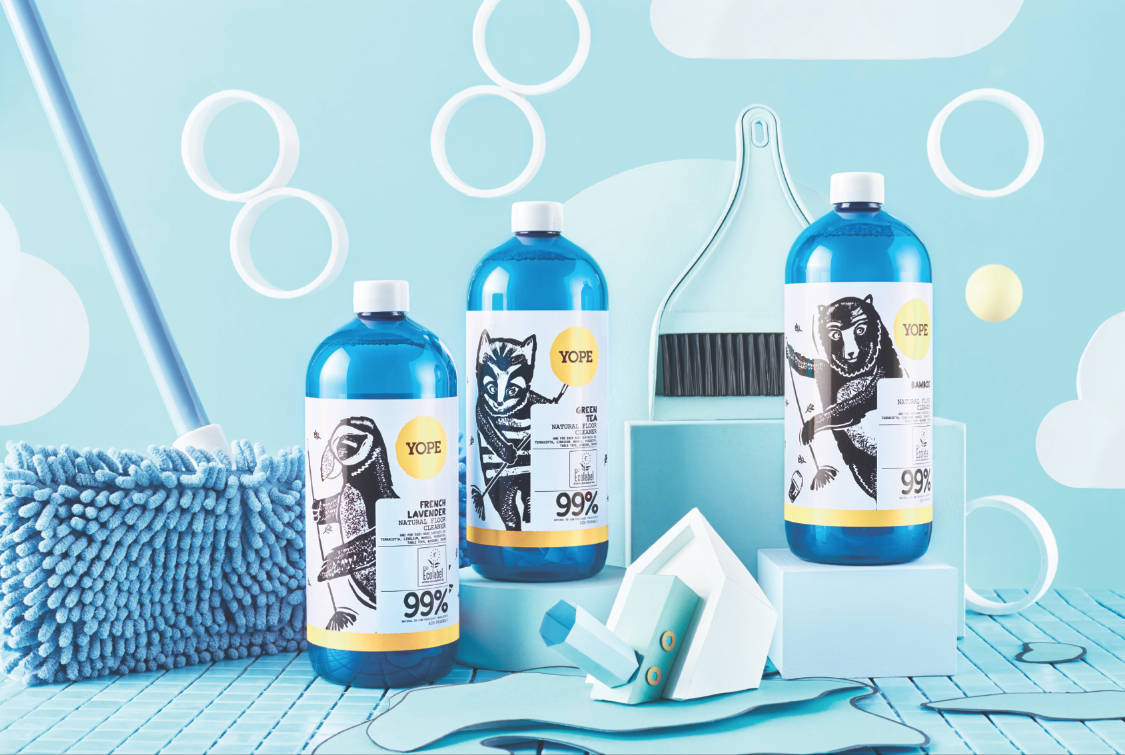
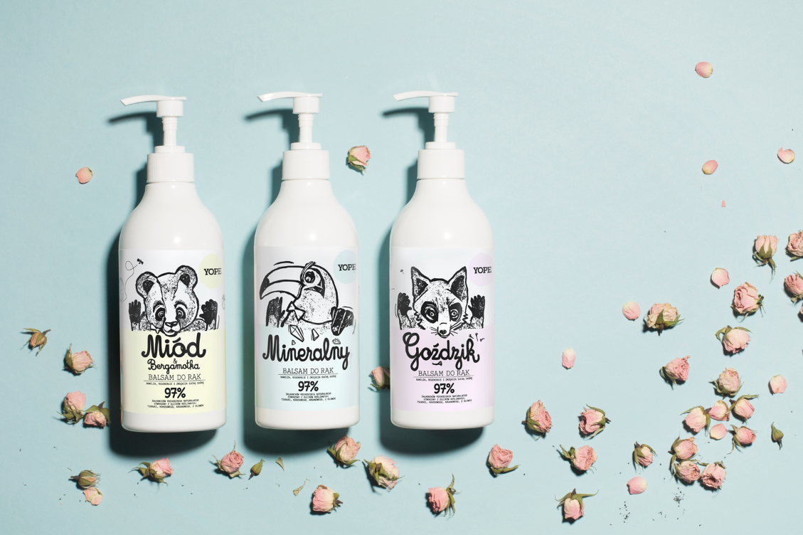
Identification and packaging project for the Polish brand YOPE, which offers unique cosmetics for everyday use. The brand stands out thanks to its formulas — over 90% natural ingredients, without any parabens, SLS, SLES nor silicones. The fragrances are sophisticated, interesting and long-lasting. YOPE offer includes body cosmetics, as well as unique kitchen series and cleaning agents. Hand soap for children and aromatic candles are our novelties. YOPE is constantly developing creating new, universal products, which turn ordinary moments into unique and pleasant ones thanks to their simple functions. 

Projekt identyfikacji i opakowań polskiej marki YOPE, która oferuje unikalne kosmetyki codziennego użytku. Markę wyróżniają receptury – ponad 90 proc. naturalnych składników, bez parabenów, SLS-u, SLES-u, sylikonów, i zapachy: wyszukane, ciekawe i trwałe. W ofercie YOPE są kosmetyki do pielęgnacji ciała, delikatna dla dłoni linia kuchenna i ekologiczne środki czystości. Nowością są mydła do rąk dla dzieci i niezwykle aromatyczne świece. YOPE ciągle się rozwija – tworzy nowe, uniwersalne produkty, które dzięki swoim prostym funkcjom ulepszają codzienność.

Screen Shot 2019-01-07 at 18.09.05 Screen Shot 2019-01-07 at 18.09.33

Read More

Screen Shot 2019-01-03 at 18.56.07 Screen Shot 2019-01-03 at 18.56.19project Politechnika Warszawska
design Emilka Bojańczyk / Podpunkt
format various
typeface Radical WUT, Adagio Slab
paper uncoated, structured 
client Politechnika Warszawska
year 2016
link www.podpunkt.pl

The identification of the Warsaw University of Technology introduces consistency, with a simultaneous high flexibility of graphic designs. The design studio proposed an idea, which enables building a skillful, catch-word communication, allowing the university to introduce important values. It covered all the university’s 20 faculties, while allowing them to keep their historical markings. 

Identyfikacja wprowadza spójną komunikację wizerunkową, pozwalając jednocześnie na dużą elastyczność w kreowaniu materiałów graficznych uczelni. Projekt objął wszystkie 20 wydziałów: zachowano ujednolicone graficznie historyczne sygnety i wprowadzono spójną konstrukcję logotypów (krój Radical WUT). Typograficzna identyfikacja wyznacza również zasady budowania sloganów komunikujących wartości uczelni.

Read More

Screen Shot 2019-01-03 at 18.44.50 Screen Shot 2019-01-03 at 18.44.43 Screen Shot 2019-01-03 at 18.44.55project Ministerstwo Dobrego Mydła
design Paris+Hendzel studio / Łukasz Hendzel
typeface Modern Sans
paper coated coloured 
print run 10 000
client Ministerstwo Dobrego Mydła
year 2017
link www.parishendzelstudio.com

 Ministerstwo Dobrego Mydła is a company producing quality handmade soaps and cosmetics. The secret to their success are good materials, good craftsmanship and hard work. The seal in the logotype depicts a large stone lying in the waters of the Dziwna River, a canal connecting the waters of the Szczeciński Bay and the Baltic Sea, from which the name of the town Kamień Pomorski [Pomeranian Stone] comes from, their birthplace. 

Ministerstwo Dobrego Mydła to mała rodzinna manufaktura mydlarska. Założona została przez siostry Anię i Ulę Bieluń w położonym na północnym zachodzie kraju Kamieniu Pomorskim. Firma oferuje ręcznie wyrabiane mydła i kosmetyki, charakteryzujące się unikalnym doborem surowców i dobrym rzemiosłem. Sygnet logotypu przedstawia kompilację mydła i wody oraz wielki kamień leżący w korycie Dziwny, kanału łączącego Zalew Szczeciński i Morze Bałtyckie. Od tego głazu zaczerpnięta została nazwa miasta Kamień Pomorski, w którym urodziły się założycielki marki.

Screen Shot 2019-01-03 at 18.45.01 Screen Shot 2019-01-03 at 18.44.37 Screen Shot 2019-01-03 at 18.44.31

Read More

Screen Shot 2019-01-02 at 18.51.14 Screen Shot 2019-01-02 at 18.51.46 Screen Shot 2019-01-02 at 18.51.55project Beyond the Desk
design Marcel Kaczmarek
typeface Line Light (by Sepus Noordmans), Courier New
paper uncoated 
print run 200
client Adam Mickiewicz Institute / Culture.pl
year 2017

Identification for the exhibition taking place during the Not Fair trade show at the Palace of Culture and Science in Warsaw. Five artists (Jan Domicz, Richard Grandmorin, Gizela Mickiewicz, Polen Performance and Małgorzata Szymankiewicz), showed their latest works, in which they focus on office space. They explore tensions, frustrations and ambiguities, which accompany people in workplaces.

Identyfikacja wystawy odbywającej się przy okazji targów Not Fair w Pałacu Kultury i Nauki w Warszawie. Pięcioro artystów (Jan Domicz, Richard Grandmorin, Gizela Mickiewicz, Polen Performance i Małgorzata Szymankiewicz) pokazało swoje najnowsze prace, w których skupiają się na przestrzeni biurowej. Eksplorują napięcia, frustracje i niejasności towarzyszące ludziom w miejscach pracy.

Screen Shot 2019-01-02 at 18.51.28

Read More

Screen Shot 2019-01-02 at 18.47.50 Screen Shot 2019-01-02 at 18.47.44 Screen Shot 2019-01-02 at 18.47.38 Screen Shot 2019-01-02 at 18.47.28project Eastern European Art Connection
design Dagmara Berska / Parastudio
typeface HK Grotesk
paper uncoated, structured 
print run 500
client EEAC
year 2016
link www.parastudio.pl

The visual identity for Eastern European Art Connection – EEAC, concentrates on promoting and showcasing young, talented painters and sculptors from Central and Eastern Europe, as well as artists, whose work has been shown at international exhibitions and whose names are already established in the art world.

Identyfikacja Eastern European Art Connection – EEAC – koncentruje się na promowaniu młodych, utalentowanych malarzy i rzeźbiarzy ze środkowej i wschodniej Europy. Jak również tych artystów, których prace prezentowane były na międzynarodowych wystawach oraz których imię przyjęło się w świecie artystycznym.

Read More

Screen Shot 2018-05-06 at 12.13.00 Screen Shot 2018-05-06 at 12.13.06 Screen Shot 2018-05-06 at 12.13.13project Wewoo
design Necon
typeface Gentona Font Family, Sim Hei Regular
print run 200
year 2016
link www.necon.co

The Wewoo brand name is formed with two Chinese words: “light and darkness,” and “divine.” The duality rendered by this choice is a reflection on the subject of video art. The resulting work is a visual identity which elegantly epitomizes Wewoo’s three tenets – showing care and thought, following the philosophy of yin and yang, and demonstrating dedication commonly associated with the photosensitive gelatin-silver film photographic process. Both the Wewoo name and design perfectly reflect Wewoo’s main slogan: “Being everywhere like a faint light.” The idea behind this message is to not be so bright as to blind, but be visible enough to light the way.

Nazwa marki Wewoo jest utworzona z dwóch chińskich słów: „światło i ciemność” oraz „boskość”. Dwoistość skojarzeń odnosi się do tematu sztuki wideo. Powstała praca to identyfikacja wizualna, która w elegancki sposób uosabia założenia firmy – odpowiedzialność myśli i filozofię yin yang. Zarówno nazwa Wewoo, jak i projekt graficzny doskonale odzwierciedlają przesłanie głównego hasła firmy: „Być wszędzie oznacza być w słabym świetle”, które tłumaczy, że nie powinniśmy oślepiać swoich widzów, ale być na tyle widocznymi, aby oświetlić drogę.

Read More

Screen Shot 2018-04-30 at 13.18.01 Screen Shot 2018-04-30 at 13.18.10 Screen Shot 2018-04-30 at 13.18.22project Lato by Stary Browar 2016
design UVMW
illustration Joanna Fidler-Wieruszewska
typeface Fedra
print run 1000
client Stary Browar in Poznań
link www.uv-warsaw.com
year 2016 

Campaign identity for Lato by Stary Browar, co-organized together with WWF Poland, the leading organization in wildlife conservation and endangered species. The campaign takes its motifs from animal cartoons and promotes both the summer programme at Stary Browar as well as an ecological mindset. The graphics are matched by playful texts – idiomatic expressions which announce the campaign’s various stages. The energetic, colourful illustrations constituted a coherent communication scheme for a wide spectrum of cultural events. The campaign was realized both in traditional media (flyers, outdoor advertising), as well as on summer loungers available throughout the park which surrounds Stary Browar. 

Projekt identyfikacji kampanii Lato w mieście by Stary Browar realizowanej wraz z WWF Polska, organizacją zajmującą się ochroną środowiska naturalnego. Motywem przewodnim kampanii stały się motywy zwierzęce, a jej zadaniem, obok promocji programu letniego w Starym Browarze, promocja ekologii. Motywy graficzne zostały połączone z tekstami – związkami frazeologicznymi zapowiadającymi kolejne elementy kampanii. Przykładowo: „Farbowane lisy w Starym Browarze zwiastują wiele plastycznych wydarzeń” zapowiadały zajęcia dla dzieci, a „Sokoły wzrok wytężają, gdy filmy w Starym Browarze grają” – projekcje filmowe. Hasła oparte na związkach frazeologicznych oraz energetyczne, kolorowe ilustracje w spójny i konsekwentny sposób promowały szerokie spektrum wydarzeń. Kampania została realizowana zarówno w formie tradycyjnej (ulotki, outdoor), ale też na letnich leżakach dostępnych w parku wokół Starego Browaru.

Read More

Screen Shot 2018-04-30 at 13.08.43 Screen Shot 2018-04-30 at 13.08.30 Screen Shot 2018-04-30 at 13.09.26project The National Museum in Wrocław
design Marian Misiak
co-operation Kalina Zatorska, Damian Langosz, Łukasz Nawrocki
typeface Dia Grotesk, Janus
link www.threedotstype.com
year  2016 

The National Museum’s new logotype is vivid, but attuned to the institution’s overall character. It simplifies how the museum communicates the structure of its four departments to guests, and ensures the integrity of all visual material. This makes it easy for guests to locate the various branches of the museum across the city. The system typefaces are: Dia Grotesk, which was inspired by early 20th century Grotesks and allude to the aesthetic and period of the modernist Four Domes Pavillon, and the serif Janus typeface, whose italics are both left and right-leaning, which will be used for book publications. 

Nowy, wyrazisty, a zarazem dostosowany do charakteru muzeum znak graficzny dla czterech oddziałów Muzeum Narodowego uprościł komunikat o strukturze instytucji, zapewnia spójność materiałów wizualnych oraz ułatwia odbiorcom identyfikację oddziałów muzeum w przestrzeni miasta. Kluczowym elementem identyfikacji jest typografia. Fontami systemowymi są kroje: Dia Grotesk (inspirowany wczesnymi groteskami z początku XX w., nawiązujący do estetyki i okresu powstania Pawilonu Czterech Kopuł) i krój szeryfowy Janus (posiadający kursywę zwróconą w prawo, jak i w lewo), który będzie używany do składu publikacji książkowych.

Read More

Screen Shot 2018-03-20 at 17.15.08 Screen Shot 2018-03-20 at 17.15.56 Screen Shot 2018-03-20 at 17.15.25project Autor Rooms
design Mama Studio
format various
typeface Tiempos Headline
paper uncoated, structured
print run 500 
client Mama Studio
year 2016
link www.mamastudio.pl

Visual identity design for the Autor Rooms project – a place for admirers of beautiful design who expect bespoke hospitality. The logotype’s sigil contains a key – a symbol of hotels, which also symbolically offers tenants the key to a city vibrant with life and ideas.

Identyfikacja projektu Autor Rooms – miejsca dla tych, którzy cenią piękny design i oczekują gościnności uszytej na miarę. W sygnecie logo pojawia się klucz, który oprócz tego, że jest symbolem hotelarskim, jest również obietnicą pokazania gościom miasta tętniącego życiem i pomysłami.

Screen Shot 2018-03-20 at 17.15.15 Screen Shot 2018-03-20 at 17.16.31 Screen Shot 2018-03-20 at 17.15.29

Read More

01_fox box 03_fox box 02_fox boxproject FOX BOX Art of steel
design Polkadot
link behance/studio_polkadot

Visual identity for a Łódź company which specializes in the design and construction of mobile architectural modules made from sea freight containers.  

Identyfikacja graficzna łódzkiej firmy zajmującej się projektowaniem i tworzeniem mobilnych modułów architektonicznych z kontenerów morskich.

Read More