— print control

22af4392076829.5ec2996542eb5 c3484592076829.5e425ff76ece9 b7439192076829.5ec2996543434 Screen Shot 2020-07-23 at 13.41.19
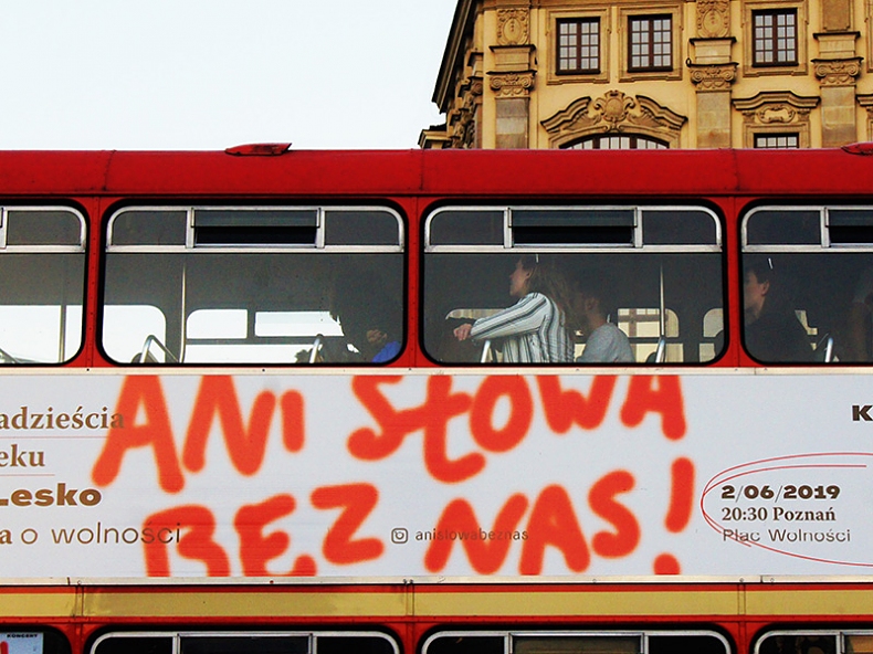
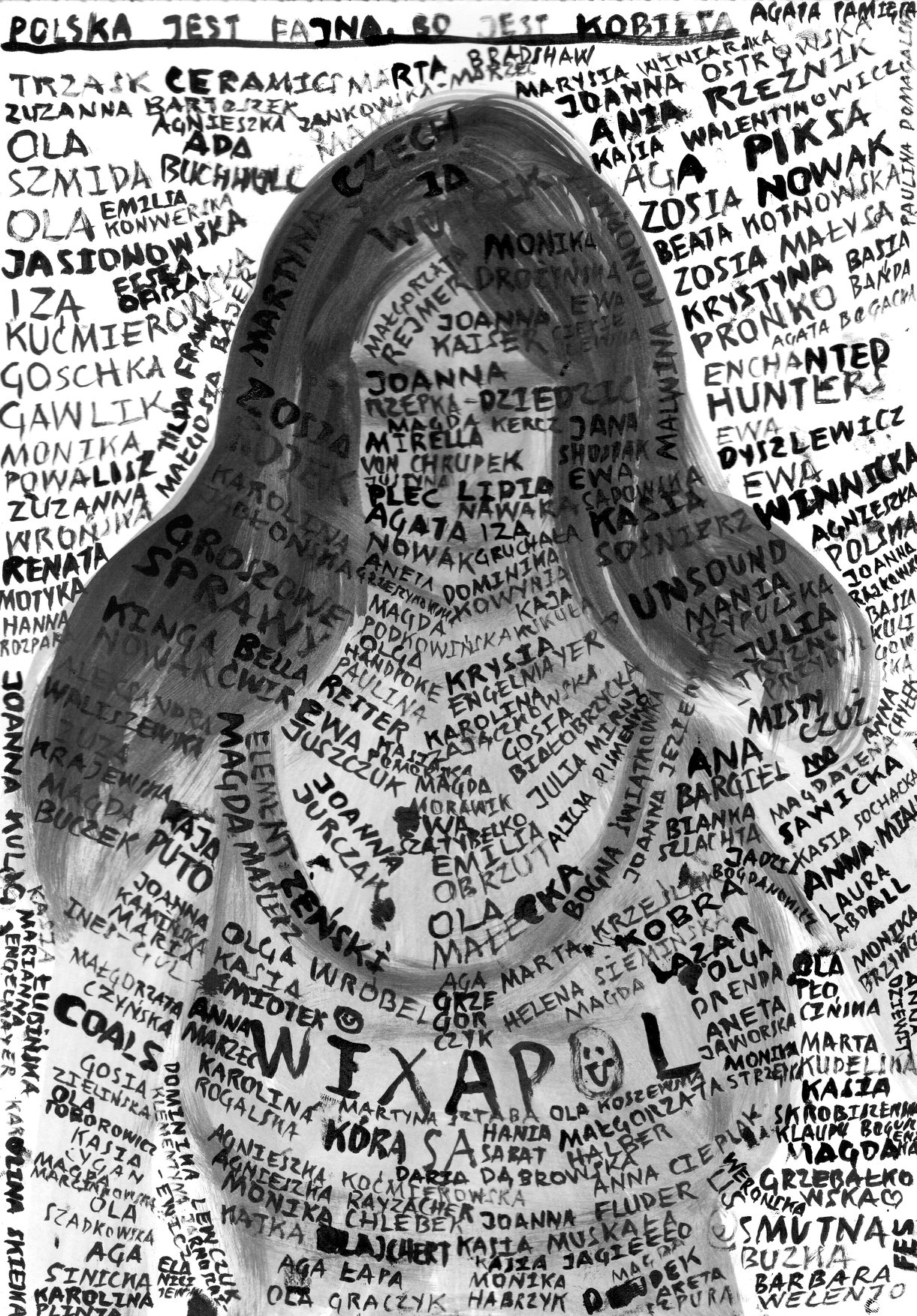
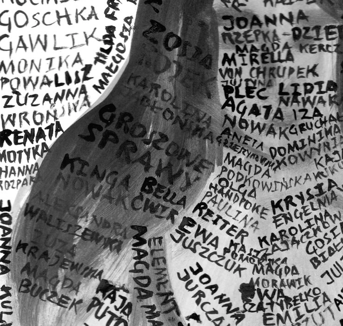
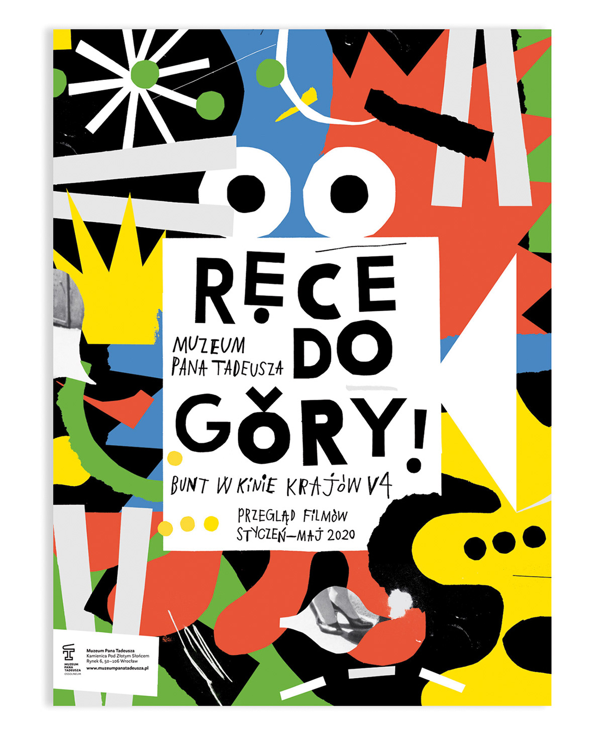
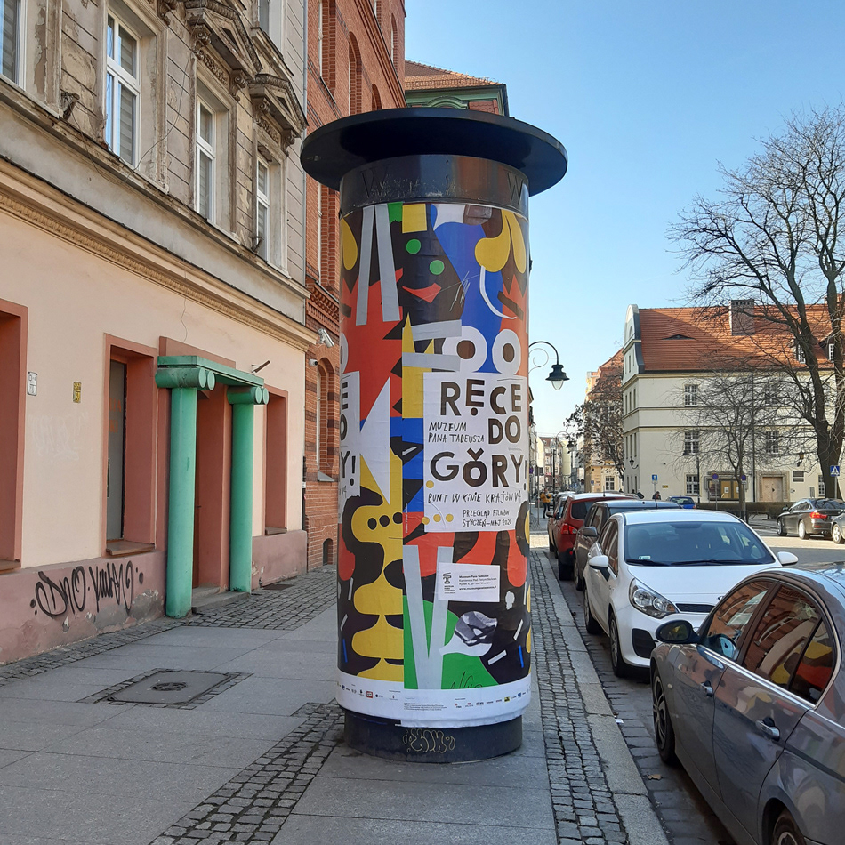
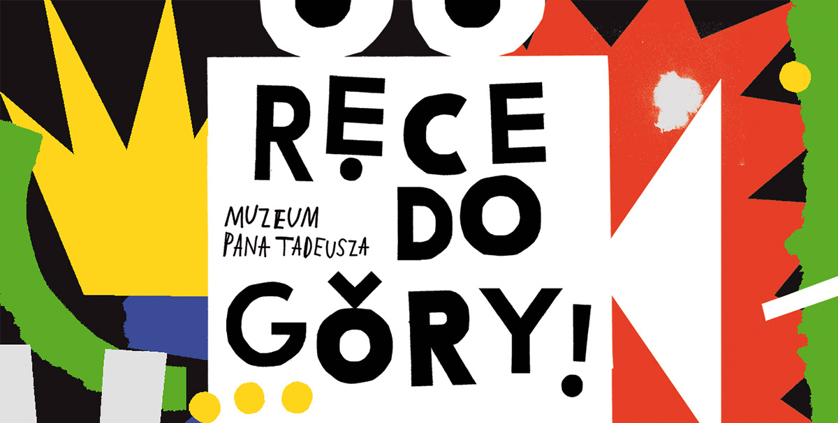
project Ręce do góry!
design Paweł Mildner
format 700×1000 mm
typeface custom
paper coated
publisher Muzeum Pana Tadeusza
year 2020

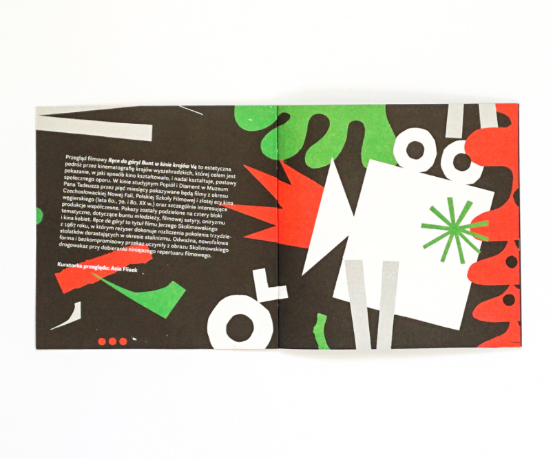
Poster design for “Hands up!” Rebellion in V4 cinema – a film project held by Pan Tadeusz Museum. It aims to show the audience how the cinema shaped and reflected the attitudes of social resistance in Visegrad countries. Hands up! is the title of Jerzy Skolimowski’s film from 1967, in which the director accounts for the generation of thirty-year-olds growing up in the Stalinism era. The new-wave form, uncompromising content and its origin (for 14 years the film was banned by censorship) make Skolimowski’s film a guide that we want to follow when choosing the repertoire.

Oprawa graficzna projektu „Ręce do góry!” Bunt w kinie krajów V4  – filmowego wydarzenia, którego celem jest pokazanie publiczności, w jaki sposób kino kształtowało i odzwierciedlało postawy obywatelskiego oporu w krajach grupy wyszehradzkiej. Ręce do góry! to tytuł filmu Jerzego Skolimowskiego z 1967 roku, w którym reżyser dokonuje rozliczenia pokolenia trzydziestolatków dorastających w okresie stalinizmu. Odważna, nowofalowa forma, bezkompromisowy przekaz i historia (przez czternaście lat film był zakazany przez cenzurę) czynią z obrazu Skolimowskiego drogowskaz, którym kierujemy się, dobierając repertuar filmowy.


Read More

Screen Shot 2019-10-16 at 13.09.22project Solidarity
design Paweł Jońca
format 500×700 mm
typeface custom
paper uncated
print run on demand
publisher self-published
year 2019

The poster was created as an illustration for an interview with the psychotherapist Wojciech Eichelberger, published in the magazine Zwierciadło (8/2019). The conversation revolved around the importance of contemporary social solidarity, which is characterized by individualism, competition and greed rather than unity, compliance and community.

Plakat oryginalnie zaprojektowany jako ilustracja do wywiadu z psychoterapeutą Wojciechem Eichelbergerem, który ukazał się w magazynie „Zwierciadło” (8/2019). Opublikowana rozmowa dotyczyła znaczenia solidarności społecznej w dzisiejszych czasach, które charakteryzuje raczej indywidualizm, rywalizacja i chciwość niż jedność, zgodność i komitywa.


Read More

Screen Shot 2020-07-22 at 16.46.16project 11. Lublin Jazz Festival
design Krzysztof Iwański
format 700×1000 mm
typeface Suisse Int’l Black
paper uncoated matt
print run 1600
publisher Centre for Culture in Lublin 
year 2019

Promotional poster for the 11th Lublin Jazz Festival. From day one, the concept of the festival was to present the most interesting Polish and foreign jazz music projects from a broad spectrum – from the most prominent representatives of the contemporary jazz scene and mainstream projects, thorugh improvised music and young aspiring artists. The musical events are always accompanied by many visual and educational activities, as well. 

Projekt plakatu promującego 11. edycję Lublin Jazz Festiwal. Od początku ideą festiwalu jest prezentacja najciekawszych polskich i światowych wydarzeń muzycznych z szeroko pojętej muzyki jazzowej – projektów najwybitniejszych przedstawicieli współczesnej sceny jazzowej, od nurtu głównego po muzykę improwizowaną, a także młodych początkujących artystów. W ramach festiwalu tworzone są również projekty specjalne, niesłyszane dotąd w żadnym innym miejscu. Wydarzeniom muzycznym towarzyszą zawsze działania wizualne i edukacyjne.


Read More

Screen Shot 2020-07-22 at 16.34.24 Screen Shot 2020-07-22 at 16.35.01 Screen Shot 2020-07-22 at 16.34.45 Screen Shot 2020-07-22 at 16.35.43 Screen Shot 2020-07-22 at 16.35.32 Screen Shot 2020-07-22 at 16.34.34 Screen Shot 2020-07-22 at 16.34.52 Screen Shot 2020-07-22 at 16.35.12project The Internets
design Noviki
photos Szymon Rogiński
format 182×209 mm
typeface hk grotesk
paper coated, canvas
print run 400
publisher Narodowy Instytut Architektury i Urbanistyki
year 2019

While working on the book, the designers wondered how to present the impact that automation technology, sharing economy, and artificial intelligence have had on the evaluation of an artistic work itself. That is why they have subjected Szymon Rogiński’s photographs to the evaluation of internet algorithms used for the automatic rating and description of photo images. Of course, artificial intelligence did not take into account the context of the displayed works, like most things that we observe on the web. Furthermore the evaluations and descriptions of Szymon Rogiński’s photography were based on an indefinite/unknown algorithm, questioning the methodology of the evaluation of an artistic work itself.  

Projektanci, pracując nad koncepcją książki, zastanawiali się, jak pokazać wpływ technologii automatyzacji, ekonomii wymiany i sztucznej inteligencji na ocenę samego dzieła artystycznego. Dlatego fotografie Szymona Rogińskiego poddali ocenie algorytmów sieciowych służących do automatycznej oceny i opisu obrazów fotograficznych. Oczywiście sztuczna inteligencja nie uwzględniała kontekstu wyświetlanych prac, podobnie jak większość rzeczy, które obserwujemy w sieci, również oceny i opisy fotografii Szymona Rogińskiego opierały się na nieokreślonym/nieznanym algorytmie, kwestionując metodologię oceny samego dzieła artystycznego.


Read More

IGA_SARZYNSKA_Strona_1 - Grzegorz Podsiadlik IGA_SARZYNSKA_Strona_2 - Grzegorz Podsiadlik IGA_SARZYNSKA_Strona_3 - Grzegorz Podsiadlik IGA_SARZYNSKA_Strona_4 - Grzegorz Podsiadlik IGA_SARZYNSKA_Strona_5 - Grzegorz Podsiadlikproject IGA SARZYŃSKA Wzrusza Toruń
design Parastudio / Dagmara Berska
illustration Aleksandra Morawiak 
format various
typeface Ginto
paper colored, uncoated, recycled
print run various
client IS-MK Iga Sarzyńska Maciej Komorowski Spółka Cywilna
year 2019

Design for the Iga Sarzyńska Wzrusza Toruń brand includes a logotype, ephemeral prints and visual identification, as well as an extensive packaging system for the artisan gingerbread and chocolates. They also developed a project for the placement of the visual identification in boutiques in the city of Toruń. 

Projekty dla marki Iga Sarzyńska Wzrusza Toruń to oprócz logotypu, akcydensów i identyfikacji wizualnej rozbudowany system opakowań na pierniki artystyczne i czekolady oraz projekt wdrożenia identyfikacji wizualnej w butikach w Toruniu.


Read More

Screen Shot 2020-07-13 at 17.40.58 Screen Shot 2020-07-13 at 17.40.17 Screen Shot 2020-07-13 at 17.40.43 Screen Shot 2020-07-13 at 17.40.32 Screen Shot 2020-07-13 at 17.41.15project Captains of Illustration: 100 Years of Children’s Books from Poland 
design Ewa Stiasny
format 215×300 mm
typeface Aldine721EU, Dutch766EU, Futura Lt Pro, Minion Pro
paper uncoated premium smooth
print run 2000
publisher Adam Mickiewicz Institute / Culture.pl, Dwie Siostry
year 2019

Captains of Illustration: 100 Years of Children’s Books from Poland is an album that encapsulates 100 years of Polish children’s book illustrations through 100 alphabetical entries. It gives readers a vast outlook on the field itself (and its many achievements since 1918), while outlining the subject areas and themes appearing within the illustrations, artistic techniques and stylistic tendencies. It also introduces readers to prominent children’s book illustrators and the most significant publishing series. Illustrations are the focal point in this publication, with over 900 works by 200+
Polish illustrators. 

„Captains of Illustration: 100 Years of Children’s Books from Poland” to album, który ujmuje stulecie polskiej ilustracji książkowej dla dzieci w 100 alfabetycznie ułożonych hasłach. Dają one przekrojowy obraz dorobku tej dziedziny począwszy od roku 1918, opisując obszary tematyczne i motywy pojawiające się na ilustracjach, techniki artystyczne, tendencje stylistyczne, najznamienitszych ilustratorów książek dla dzieci i najbardziej znaczące serie wydawnicze. Esencją książki są ilustracje – zgromadzono tu ponad 900 prac autorstwa ponad 200 polskich ilustratorów.


Read More

Screen Shot 2020-07-13 at 17.34.52 Screen Shot 2020-07-13 at 17.32.37 Screen Shot 2020-07-13 at 17.32.22 Screen Shot 2020-07-13 at 17.35.13 Screen Shot 2020-07-13 at 17.35.20project Droho PL
design Punkt Widzenia/ Michał Siciński
format 104×148 mm
typeface Helvetica
paper uncoated
print run 500
publisher NOVArte / Droho
year 2019

DROHO.PL is the consecutive  installments of a photographic project complemented by “life’s poetry.” The author, Maciej Zakliczyński, looks for various forms of expressing what surrounds him, inspires him, and that which is uplifting yet sometimes also hindering. 

DROHO.PL to kolejna odsłona projektu fotograficznego połączonego z poezją codzienności. Autor Maciej Zakliczyński poszukuje różnych form wyrażania tego, co go otacza, daje mu inspirację, buduje, a czasem frustruje.


Read More

Screen Shot 2020-07-13 at 17.26.13 Processed with VSCO with c8 preset wlepy_pop plakaty 8312bc40ababee3f052ff60cdc691494 cbfc60d363509bb1766f00a0d090b10fproject Ani słowa bez nas!
design Bękarty
format various
typeface various
paper uncoated
print run various
client Malta Foundation
year 2019

The Ani słowa bez nas [Not a Word Without Us] project was part of the celebrations for the 30th anniversary of the Polish Round Table Talks, the free elections in Poland and part of the Freedom and Solidarity Day. The visual communication of the campaign was based on the slogans from an essay by American historian Timothy Snyder. The graphic inspiration was taken from the works of Polish conceptual artists from the 70’s and 80’s, including Leszek Przyjemski, and used the black, white and red color scheme that was characteristic of the democratic rule in Poland after 1989 (referring to the colors of the Solidarity Labour Union and Gazeta Wyborcza’s esprit) . The goal of the campaign was to motvivate young people to participate in elections. The campaign used large format media, posters as well as stickers. 

Projekt „Ani słowa bez nas” był częścią obchodów 30-lecia obrad Okrągłego Stołu i wolnych wyborów w Polsce w ramach Święta Wolności i Solidarności. Komunikacja kampanii została oparta na hasłach eseju amerykańskiego historyka Timothy’ego Snydera. Inspiracją graficzną były prace polskich artystów konceptualnych z lat 70. i 80., między innymi Leszka Przyjemskiego, oraz charakterystyczne dla kształtowania się po 1989 roku demokracji w Polsce kolory czarno-biało-czerwone. Celem kampanii było aktywizowanie młodych ludzi do udziału w wyborach. W kampanii zostały wykorzystane nośniki wielkoformatowe, plakaty i wlepki.


Read More

box_zoom1-1920x1279 foto_next_pack_011-1920x1280 foto_next_pack_021-1920x1280 foto_pack_next1-1920x1280 visit_cards1-1920x1280 Screen Shot 2019-09-30 at 19.21.09 Screen Shot 2019-09-30 at 19.20.43project Jit Team
design 247 Studio
format various
typeface custom
paper uncoated, colored
print run various
client Jit Team
year 2018

Visual identity design for the Jit Team company who specaliize in building teams of IT specialists to produce software. In order to expand its services and offer them a wider group of clients, Jit decided to refresh its image and conduct a complete rebranding. The designers created a new company name, logo, website, and marketing materials, and designed the company’s office space. 

Identyfikacja firmy Jit Team specjalizującej się w budowaniu zespołów specjalistów IT wytwarzających oprogramowanie. By móc swoją usługę zaoferować szerszej grupie klientów, Jit zdecydował się odświeżyć swój wizerunek i przeprowadzić gruntowny rebranding. Projektanci stworzyli nową nazwę firmy, logo, stronę internetową, materiały marketingowe oraz zaprojektowali przestrzeń biurową.


Read More

62152425_2432296026793938_3717184715971624960_o Screen Shot 2020-07-03 at 18.29.07project Poland is Cool, ‘Cause It’s a Woman / Polska jest fajna, bo jest kobietą
design Bolesław Chromry 
format 300×420 mm
typeface custom
paper matt
print run limited
publisher self-published
year 2019 

Poster by Bolesław Chromry – cartoonist, author of graphic novels, painter and graphic artist. Poland Is Cool ‘Cause It’s a Woman is comprised of the names of female artists, creators and organizers whom the artist finds important, and who have or have had a strong impact on contemporary Polish art and culture. 

Autorski plakat Bolesława Chromrego, rysownika, autora powieści graficznych, malarza i grafika. „Polska jest fajna, bo jest kobietą” to kompozycja przedstawiająca listę imion i nazwisk ważnych dla autora kobiet, artystek, twórczyń, organizatorek, które silnie oddziałują na polską kulturę i sztukę.


Read More