— print control

Screen Shot 2020-03-30 at 15.30.48 project Rojst
design Dawid Ryski
format 700×1000 mm
typeface Bureau GroteskPl, ITC Avant Garde Gothic
paper coated
print run 100
publisher Showmax
year 2018

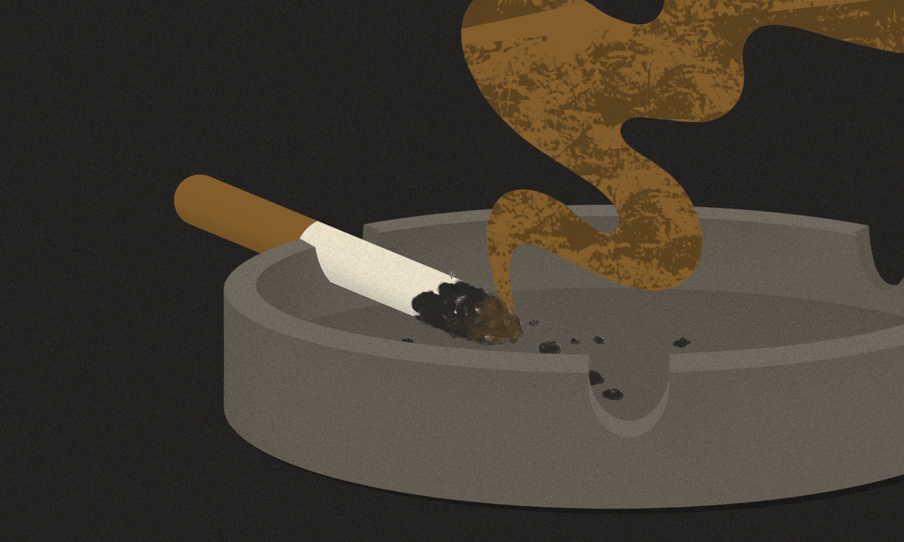
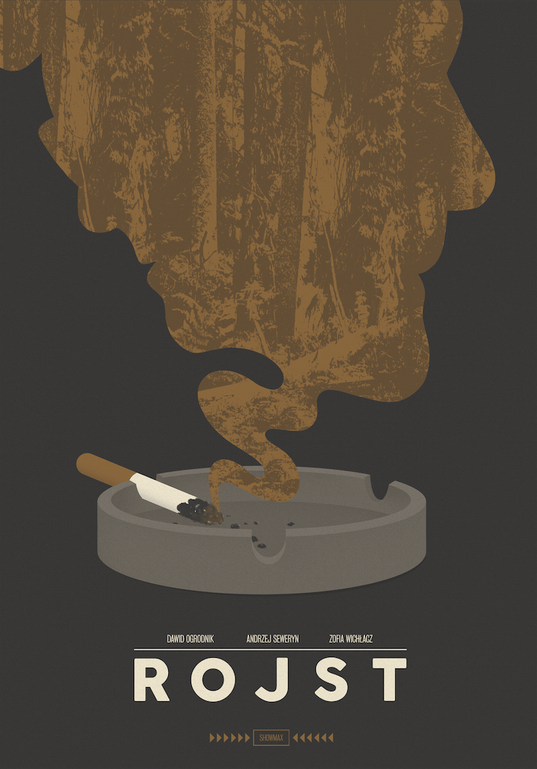
Poster promoting the Polish crime TV series “Rojst”, directed by Jan Holoubek and produced by Showmax and Kadr film studio. The series showsw the reality of the former Polish People’s Republic in the mid-1980s. The word “rojst means” swamp, and the eponymous swamp is represented by the world depicted within the series. Its characters, for various reasons, get stuck in a system that impairs their lives and the gray, somber socialist reality resembles an unpleasant marshland.  

Plakat do polskiego serialu kryminalnego „Rojst” w reżyserii Jana Holoubka, wyprodukowany przez Showmax oraz Studio Filmowe Kadr. Serial ukazuje rzeczywistość Polski Ludowej w połowie lat 80. XX wieku. Słowo „rojst” oznacza bagno. Tytułowym bagnem jest cały świat pokazany w serialu. Bohaterowie z różnych przyczyn grzęzną w paraliżującym ich życie systemie, a szara rzeczywistość socjalistyczna przypomina podmokłe grzęzawisko.

Screen Shot 2020-03-30 at 15.31.48

Read More

7enVEydI_fkz_27_otwarte_06 AiC3nFmW_fkz_27_otwarte_01 efnhCUyU_fkz_27_otwarte_08 eS61ggai_fkz_27_otwarte_03 Ke1aJ193_fkz_27_otwarte_05 qoDB3WPi_fkz_27_otwarte_04 rZSE1sz8_fkz_27_otwarte_02project 27. Festiwal Kultury Żydowskiej
design Studio Otwarte
format various
typeface Suisse Int’l
paper coated matte
print run posters: 600, scratch-cards: 3000, programs: 20 000
client Stowarzyszenie Festiwal Kultury Żydowskiej w Krakowie
year 2017 

The multifaceted complexity and the dynamic rhythm of Jerusalem became the inspiration for the visual identification of the 27th edition of the Jewish Culture Festival in Kraków. The golden color – affiliated with the Festival – again finds a meaningful justification: the “Golden Jerusalem” filters through and mixes with black, white and a multiplicity of textures to reflect the character of the city. This beautiful and fascinating place is also demanding and initially not easy to decipher. The printed materials used uneven embossing and gold washable paint, which emphasise the graphic motif of a torn sheet of paper. 

Wielowarstwowość, złożoność i dynamika Jerozolimy stały się inspiracją identyfikacji wizualnej 27. odsłony Festiwalu. Złoty kolor, charakterystyczny dla FKŻ, znów znajduje głębokie uzasadnienie: Złota Jerozolima przenika się i miesza z czernią, bielą i wielością faktur, odzwierciedlając charakter miasta. Pięknego, fascynującego, ale też wymagającego i niełatwego w odbiorze. W materiałach drukowanych zostały użyte nierównomierne tłoczenia i złota ścieralna farba, które to zabiegi podkreślają motyw graficzny przedartej kartki.


Read More

thumb_v1_446_w_1920x1920_max thumb_v1_447_w_1920x1920_max thumb_v1_453_w_1920x1920_max thumb_v1_455_w_1920x1920_max thumb_v1_456_w_1920x1920_max thumb_v1_457_w_1920x1920_maxproject santex packaging system redesign
design Konrad Sybilski
format 36×36×96 mm
typeface Kievit
paper carboard
print run 1 000 000
client Mercator Medical
year 2018 

Visual identification and packaging series for a surgical, diagnostic and protective glove line from the Polish brand Santex. The graphic system informs of their use, type and medical attestations in a transparent and minimalistic way. 

Projekt identyfikacji i serii opakowań dla linii rękawiczek chirurgicznych, diagnostycznych i ochronnych polskiej marki Santex. System graficzny w przejrzysty i minimalistyczny sposób informuje o zastosowaniu produktów, typie i atestach medycznych.


Read More

0239-2-1400x1019 0206-1400x855 0208-1-1400x855 0210-1400x855 0211-1-1400x855 0214-2-1400x855 0215-1400x855 0219-1400x855 0221-1400x855 0223-1400x855project Wszystko widzę jako sztukę 
design Robert Czajka
format 265×185 mm
typeface Century Schoolbook, dedicated
paper uncoated cream
print run 2000
publisher Wytwórnia
year 2018

Illustration and book design as part of an exhibition for younger viewers about Polish contemporary art – “Wszystko widzę jako sztukę” [“I See Everything as Art”]. The publication is an invitation to enjoy art and always keep an eye open to various artistic activities around you. It encourages younger visitors to engage with art at a gallery, museum, park or even on the street.

Projekt ilustracji i książki towarzyszącej wystawie dla dzieci o polskiej sztuce współczesnej „Wszystko widzę jako sztukę”. Książka jest zaproszeniem do zabawy, do wypatrywania i analizowania najróżniejszych działań artystycznych. Zachęca do bliskiego kontaktu ze sztuką, w galerii, w muzeum, w parku, na ulicy.


Read More

Screen Shot 2020-03-30 at 15.10.52 Screen Shot 2020-03-30 at 15.10.24 Screen Shot 2020-03-30 at 15.11.06 Screen Shot 2020-03-30 at 15.10.33 Screen Shot 2020-03-30 at 15.11.01 Screen Shot 2020-03-30 at 15.10.38 Screen Shot 2020-03-30 at 15.10.00 Screen Shot 2020-03-30 at 15.11.16 Screen Shot 2020-03-30 at 15.10.08 Screen Shot 2020-03-30 at 15.10.15project Art brut: różnorodnie = diversity
design Marcin Markowski
format 220×290 mm
typeface Twentytwelve sans, Propaganda sight, Kingthings Exeter, Sporting Grotesque, Gc16 Mono, S Core Sans, Combat, GT Haptik, GT Sectra, Roboto, MinionPro, MyriadPro, Andale Mono, Cochin, Comic Sans MS, Arial Bold, Candara, Franklin Gothic, Wingdings, Times, Calibri, GillFacia MT Std
paper uncoated, dyed 
print run 200
publisher Biblioteka Główna UAP 
year 2018 

The book “Art Brut Różnorodnie”, edited by Joanna Daszkiewicz and Sonia Rammer, is a bilingual study on the works of “The Raw”. The monographic publication contains various perspectives on the conceptualization of the issue – historical, philosophical, psychological and economic – and consists of two parts. The first is composed of theoretical considerations, while the second is a monograph of Tadeusz Głowala’s work – a brut artist and a resident of the Social Welfare Home in Miszew. 

Książka „Art Brut Różnorodnie” pod redakcją Joanny Daszkiewicz i Sonii Rammer to dwujęzyczne opracowanie dotyczące twórczości „surowej”. Monografia zawiera różnorodne perspektywy konceptualizacji problemu; historyczną, filozoficzną, psychologiczną, ekonomiczną. Publikacja składa się z dwóch części, pierwsza stanowi rozważania teoretyczne, druga jest monograficznym opracowaniem twórczości Tadeusza Głowali – artysty brut, rezydenta Domu Pomocy Społecznej w Miszewie.


Read More

36271761_1774311985983625_6717674870689234944_oproject 14. Festival Cross Culture
design Julia Mirny
format 700×1000 mm
typeface Baron Neue
paper coated
print run 1000
publisher Stołeczna Estrada
year 2018

Poster promoting the 14th edition of the Cross-Culture Festival, during which performances by musicians from Angola, Mali, Senegal, Ghana, Nigeria and Ethiopia took place. Its main purpose is to open Warsaw’s residents (and guests) to the richness of contemporary global culture. So far 192 artists from 61 countries have participated in the festival since its inception. 

Plakat promujący 14. edycję festiwalu Skrzyżowanie Kultur, podczas którego zagrali muzycy z Angoli, Mali, Senegalu, Ghany, Nigerii i Etiopii. Głównym założeniem i misją festiwalu jest otwieranie warszawiaków i gości stolicy na bogactwo kultur współczesnego świata. W jego ramach swoją twórczość zaprezentowało dotychczas 192 artystów indywidualnych i grup
z 61 krajów.


Read More

Screen Shot 2020-03-23 at 17.54.06 Screen Shot 2020-03-23 at 17.53.42 Screen Shot 2020-03-23 at 17.53.58 Screen Shot 2020-03-23 at 17.53.27 Screen Shot 2020-03-23 at 17.53.48 Screen Shot 2020-03-23 at 17.53.36 Screen Shot 2020-03-23 at 17.54.13 Screen Shot 2020-03-23 at 17.54.22project Sur les Chevaux Orientaux et Provenant des Races Orientales
design Aleksandra Toborowicz
format 240×330 mm
typeface Greta Text
paper uncoated premium, metallic, structured, canvas
print run 2500
publisher National Library of Poland
year 2017

A publication based on a nineteenth-century manuscript by Count Wacław Seweryn Rzewuski concerning the Arab culture entitled “Sur les Chevaux…”. The Qatar Museums Authority commissioned a facsimile of the manuscript in three volumes from The National Library of Poland. The typographic layout reproduces the original manuscript, even keeping the margins separated by a vertical maroon line. The cover is dominated by a golden color, and the natural cream color used on the book’s spine correspond to the colors of the Arabian desert – the sun and sand. These colors combined with white, high-quality paper reflect the style of Arabian men’s traditional attire. 

Podstawą edycji jest XIX-wieczny rękopis autorstwa hrabiego Wacława Seweryna Rzewuskiego „Sur les chevaux…” dotyczący kultury arabskiej. Biblioteka Narodowa na zlecenie Qatar Museums Authority wydała faksymile rękopisu w trzech tomach. Układ typograficzny odwzorowuje układ i styl rękopisu – z zachowaniem marginesów oddzielonych pionową, bordową kreską.Do oprawy zastosowano połączenie koloru złotego z naturalnym kremem na grzbiecie, co odpowiada kolorystyce arabskiej pustyni – słońca i piasku. Barwy te w połączeniu z bielą i wysokiej jakości papierem oddają styl tradycyjnych męskich strojów wierzchnich Arabów.

Read More

Screen Shot 2020-03-23 at 17.48.22 Screen Shot 2020-03-23 at 17.48.02 Screen Shot 2020-03-23 at 17.47.52 Screen Shot 2020-03-23 at 17.48.33 Screen Shot 2020-03-23 at 17.47.44project Imperatyw. Fotografie lat 80. ze zbiorów Ośrodka KARTA
design Piotr Chuchla
format 185×255 mm
typeface Space Mono
paper coloured, recycled, coated matt
print run 500
publisher The Karta Centre
year 2017 

Handout publication design which accompanied the exhibit entitled “Imperatyw. Fotografie lat 80. ze zbiorów Ośrodka KARTA” [“Imperative. Photographs from the 1980s from the KARTA Center collection”], during which 30 prints were presented. The images were taken to show the reality of the PRL’s [Polish People’s Republic] last decade. Among the authors are: Witold Górka, Tomasz Tomaszewski, Tomasz Abramowicz and Wojciech Druszcz. 

Projekt bezpłatnej publikacji towarzyszącej wystawie „Imperatyw. Fotografie lat 80. ze zbiorów Ośrodka KARTA”, podczas której zaprezentowano 30 fotografii powstałych z potrzeby utrwalenia rzeczywistości ostatniej dekady PRL. Wśród autorów zdjęć są m.in. Witold Górka, Tomasz Tomaszewski, Tomasz Abramowicz, Wojciech Druszcz.

Read More

Screen Shot 2020-03-23 at 17.43.34project Exit Order
design Karolina Bartczak
format 700×1000 mm
typeface custom
paper coated
print run 40
publisher Klub Pogłos
year 2017

A concert poster for the American music band Exit Order, for a show which took place at the Pogłos club in Warsaw. They play hardcore punk heavily inspired by the European and American sounds of the 1980s. 

Plakat do odbywającego się w klubie Pogłos koncertu amerykańskiej grupy Exit Order, która gra hardcore punk mocno inspirowany europejskim i amerykańskim brzmieniem lat 80.


Read More

27913087_2019761421640804_4772207794397292220_oproject Diagnoza/Diagnosis
design Ola Niepsuj
format 700×1000 mm
typeface Spectral
paper glossy
print run 20
publisher Łódź Film Commission
year 2017

Poster design for Ewa Podgórska’s documentary film “Diagnoza”. The director tells the story of the arrival of the world’s first urban psychoanalyst to a shrinking town in Poland. He invites residewnts to “the couch”, where they have the opportunity to express their deepest longings and desires. 

Projekt plakatu do filmu dokumentalnego Ewy Podgórskiej pod tytułem „Diagnoza”. Reżyserka opowiada historię o przybyciu do kurczącego się polskiego miasta pierwszego na świecie psychoanalityka miast. Zaprasza on na kozetkę mieszkańców, którzy mają szansę wyrazić swoje najgłębsze tęsknoty i pragnienia.


Read More