— print control

28701640_1648912378532470_495464695345249866_o 29352201_1648915428532165_1067827773774340397_o 29060759_1648920838531624_5134289119740815842_o 28954558_1648915001865541_4573858459466928966_o 28947398_1648919675198407_6430475465504512082_o 28828764_1648915468532161_852720140049922419_o 28828556_1648916301865411_4781880773253317359_o 28827342_1648912381865803_9091168324795851833_oproject Dama w lustrze. Strategie artystyczne kobiet w latach 70. XX wieku
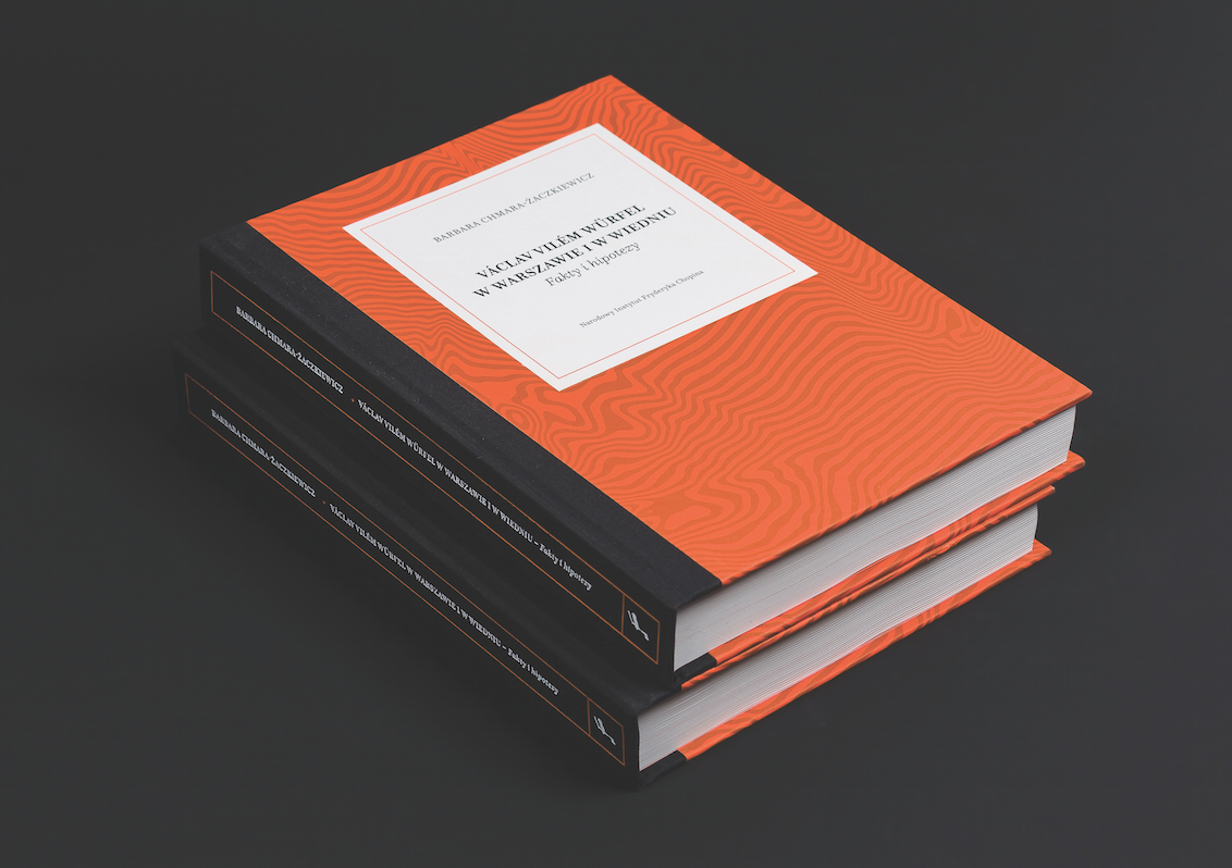
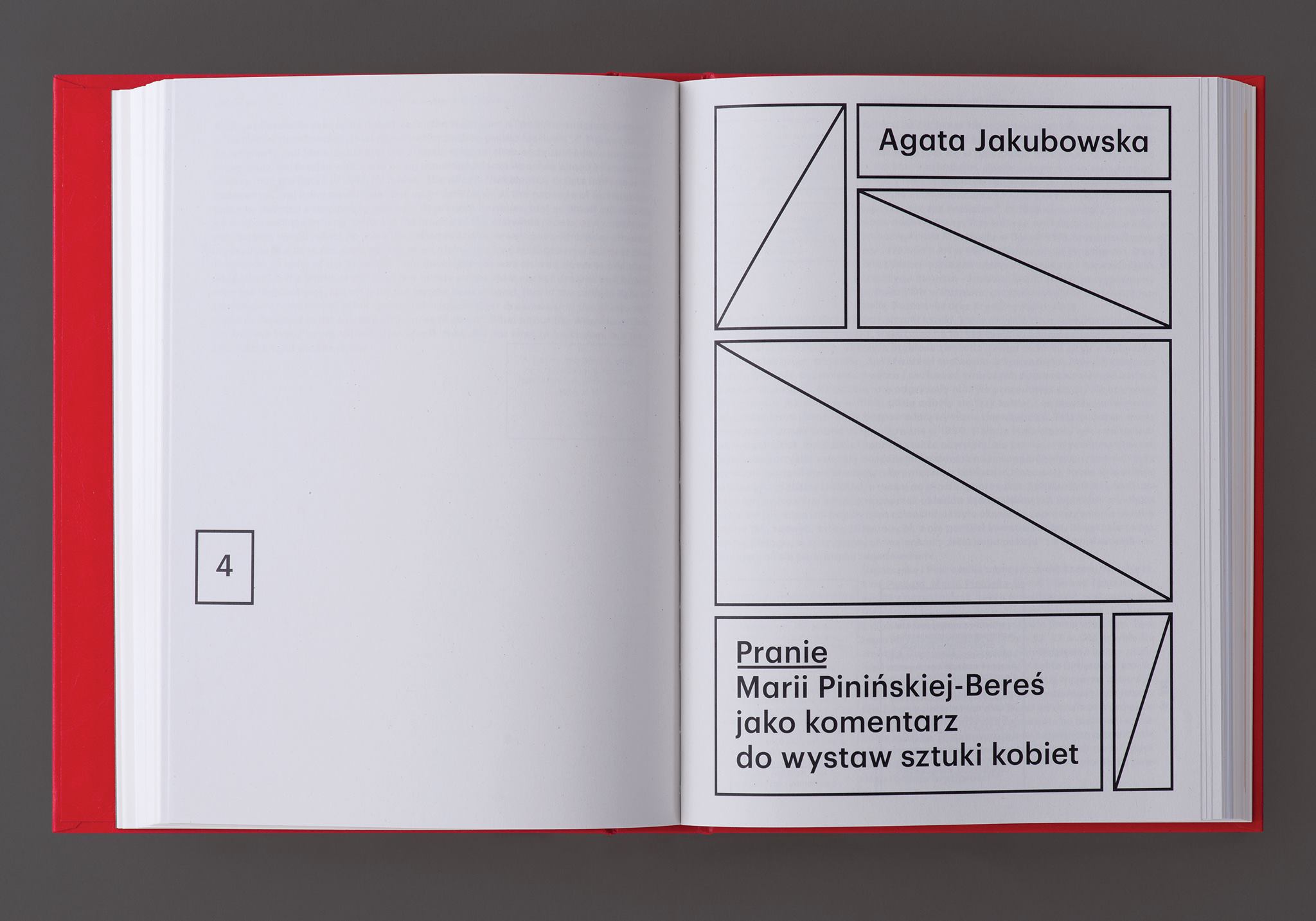
design Ryszard Bienert
format 170×230 mm
typeface Graphik
paper uncoated cream, recycled
print run 500
publisher Fundacja 9/11 Art Space
year 2018

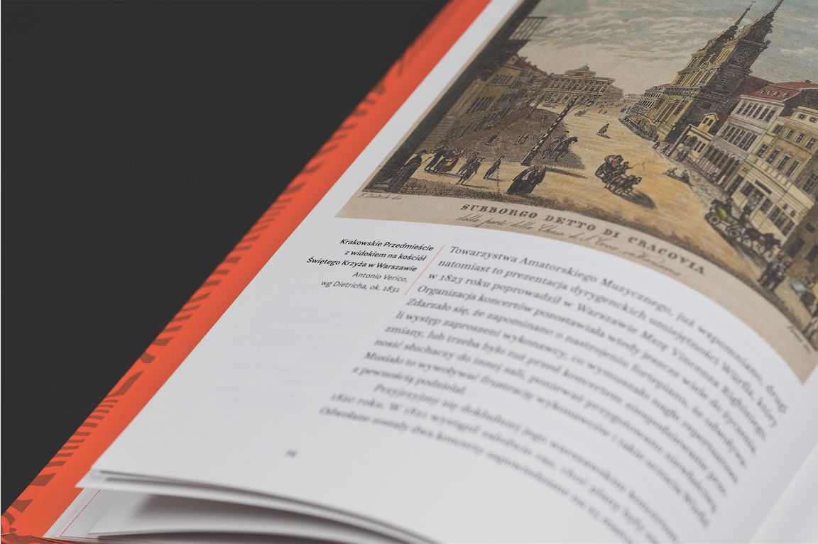
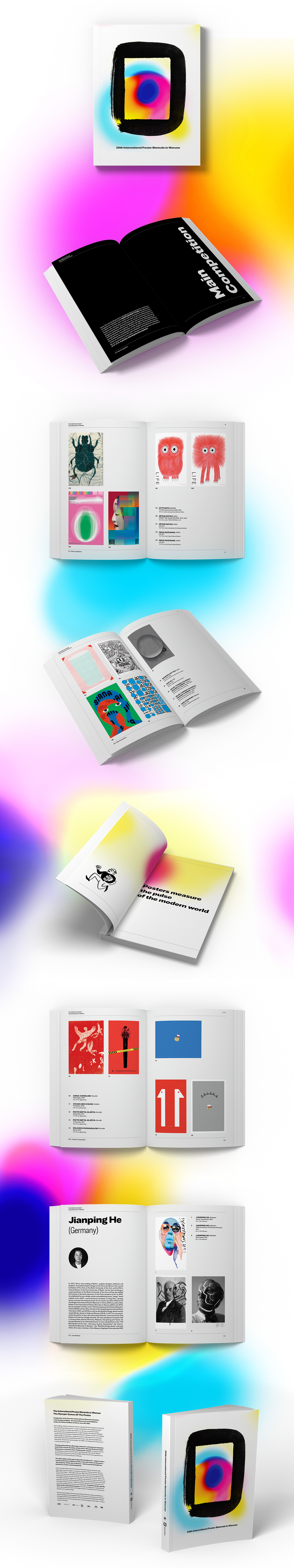
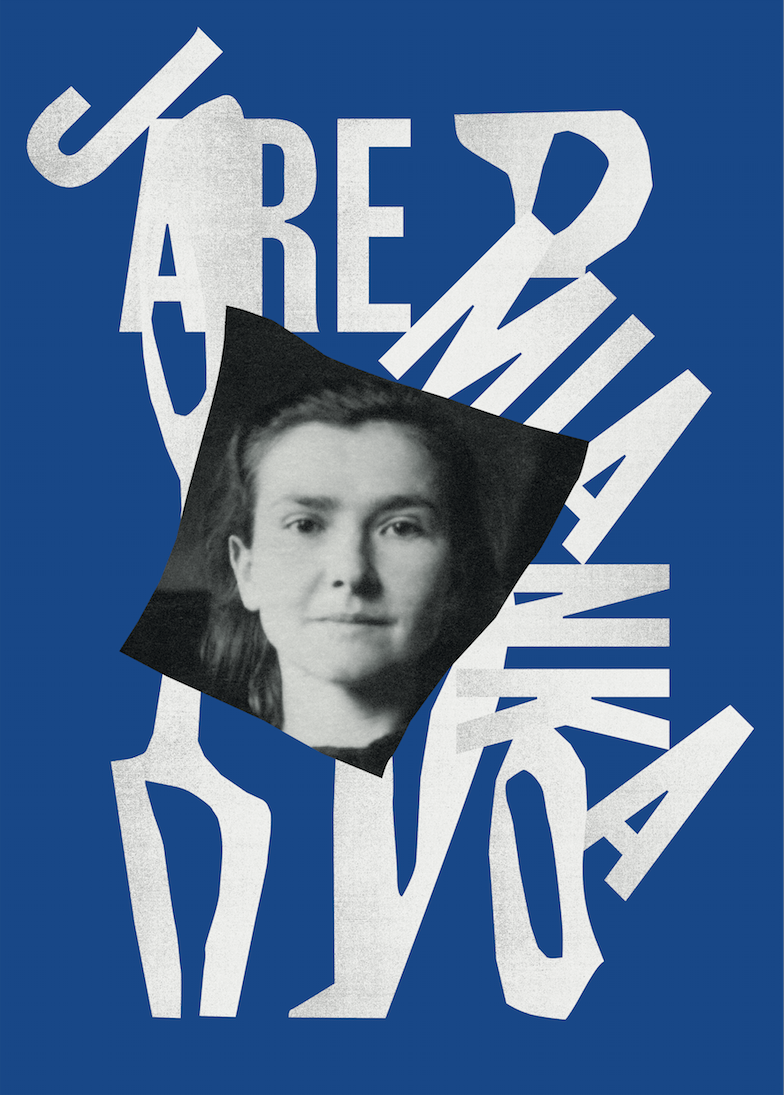
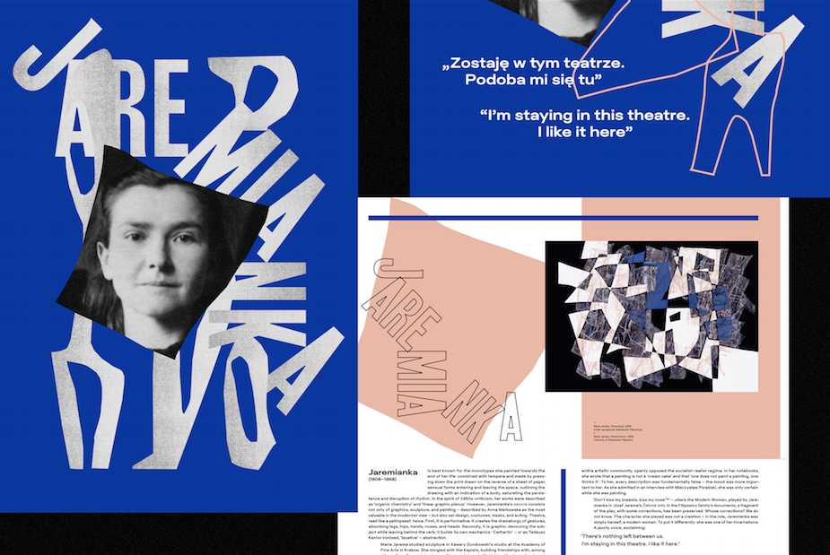
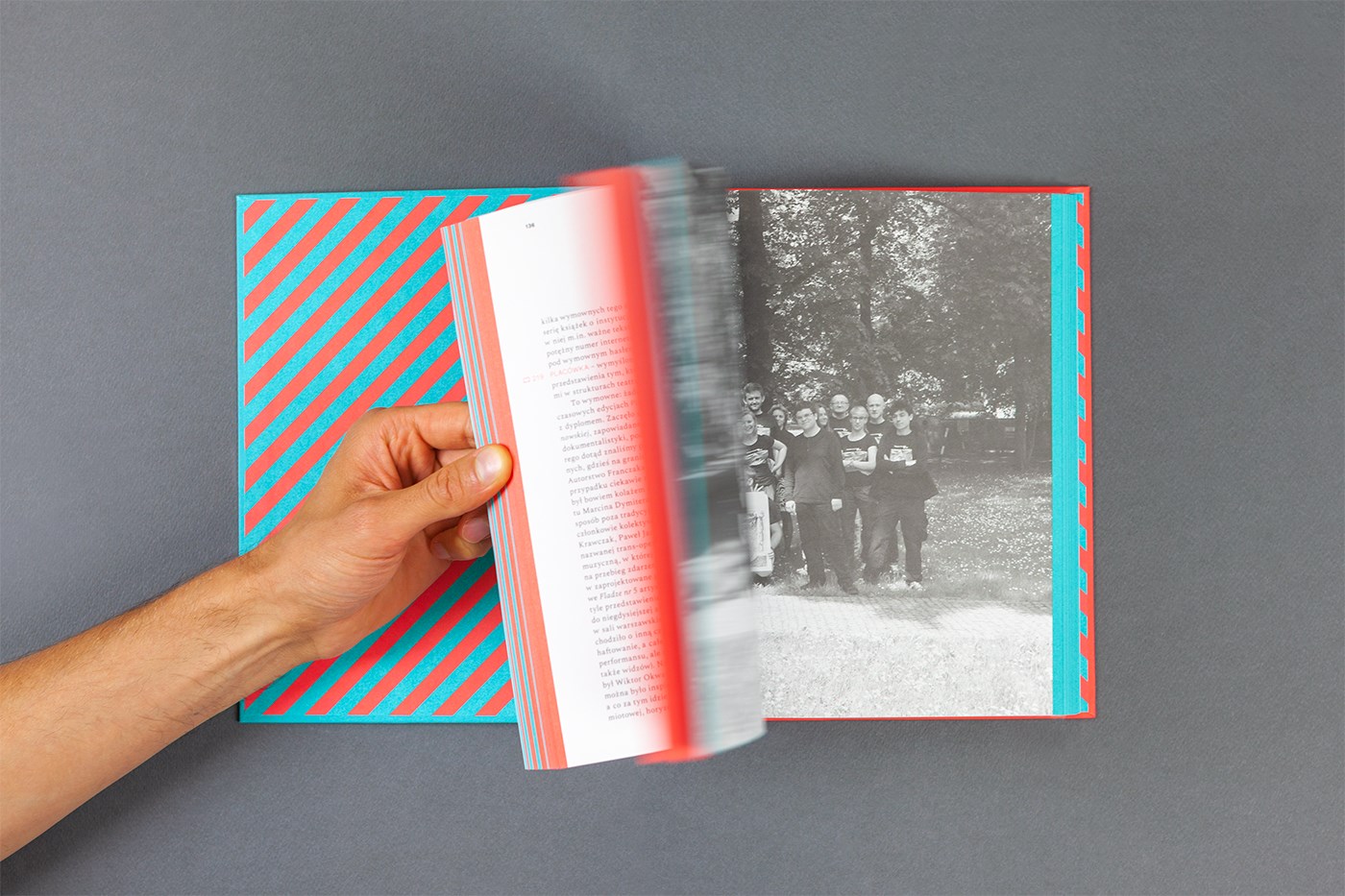
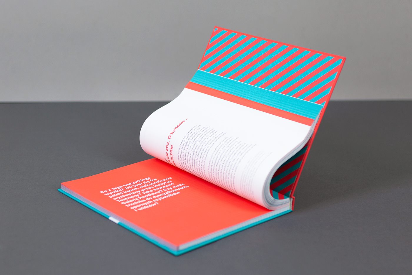
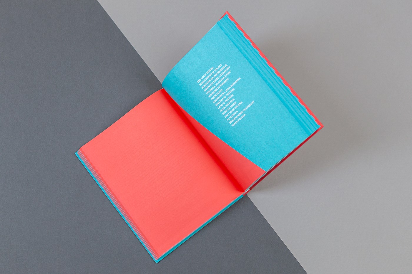
Exhibition catalog design for “Dama w lustrze. Strategie artystyczne kobiet w latach 70. XX wieku” (“Lady in the Mirror: Artistic Strategies of Women in the 1970’s”), which took place at the Piekary Gallery. The works of Izabella Gustowska, Zofia Kulik / KwieKulik, Anna Kutery, Natalia LL, Teresa Murak, Jolanta Marcolla, Ewa Partum, Maria Pinińska-Bereś and Teresa Tyszkiewicz were presented. Their artistic activity surpases Women’s Art and early feminism, aligning more with the general trends of the second Avant-Garde (Neo-Avant-Garde) which dominated Poland’s art scene in the 1970’s and early 1980’s and was centered primarily in Warsaw.

Katalog towarzyszący wystawie „Dama w lustrze. Strategie artystyczne kobiet w latach 70. XX wieku” w Galerii Piekary, podczas której zaprezentowane zostały prace Izabelli Gustowskiej, Zofii Kulik / KwieKulik, Anny Kutery, Natalii LL, Teresy Murak, Jolanty Marcolli, Ewy Partum, Marii Pinińskiej-Bereś oraz Teresy Tyszkiewicz. Ich działalność artystyczna plasuje się nie tylko w obrębie sztuki kobiet oraz wczesnego feminizmu, ale przede wszystkim wpisuje się w tendencje drugiej awangardy (neoawangardy), które w Polsce dominowały w latach 70. i na początku lat 80., a ich kolebką był przede wszystkim Wrocław.

Read More

Screen Shot 2020-04-14 at 13.04.48 Screen Shot 2020-04-14 at 13.04.03 Screen Shot 2020-04-14 at 13.04.13 Screen Shot 2020-04-14 at 13.04.22 Screen Shot 2020-04-14 at 13.04.36project Václav Vilém Würfel w Warszawie i w Wiedniu. Fakty i hipotezy
design Mateusz Kowalski
format 185×245 mm
typeface Questa Serif, Questa Sans, Questa Grande
paper uncoated premium
print run 700
publisher The Fryderyk Chopin Institute
year 2017

Publication design for the first ever monograph devoted to the life and work of Václav Vilém Würfl, a Czech composer and pianist who lived and worked in Warsaw in the years of 1815 to 1824, after which he moved to Vienna.

Projekt publikacji będącej pierwszą monografią poświęconą życiu, działalności i twórczości Václava Viléma Würfla, czeskiego kompozytora i pianisty działającego m.in. w latach 1815–1824 w Warszawie, a później w Wiedniu.

Read More

Screen Shot 2020-04-14 at 12.59.30project Co po Cybisie?
design Jakub Stępień Hakobo
format 700×1000 mm
typeface Union Bold
paper uncoated
print run 20
publisher Zachęta – National Gallery of Art 
year 2018

Poster for the exhibition “Beyond Cybis” – a large-scale exhibition of Polish paintings of the twentieth and twenty-first century which encompassed a wide spectrum of works by eminent Polish artists creating trends in major art history and current artistic movements. On the one hand, the exhibition focused on the most important – now historical – aspects which occurred after Jan Cybis. On the other hand its aim is to present works showing the state of contemporary painting, dictated by the need for experimentation and redefinition of what painting can be – which sometimes escapes the framework of a medium usually associated with canvas and paint.  

Plakat do wystawy „Co po Cybisie?” – przekrojowej ekspozycji polskiego malarstwa XX i XXI wieku, która objęła szerokie spektrum dzieł wybitnych polskich twórców wpisujących się w kluczowe nurty historii sztuki i aktualne prądy artystyczne. Międzypokoleniowy, problemowy pokaz z jednej strony koncentrował się na najważniejszych, historycznych już dzisiaj pozycjach artystycznych „po Cybisie”. Z drugiej – jego ambicją było zaprezentowanie prac ukazujących stan współczesnego malarstwa, dyktowany dążeniem do eksperymentu oraz redefiniowania, czym może być malarstwo, które wymyka się niekiedy z „ram” medium kojarzonego zwykle z płótnem i farbą.


Read More

95841477448161.5c87f687a46e2 f2400077448161.5d027b2a6964d 01bc5f77448161-1.5c87f687a4d65project 26th International Poster Biennale in Warsaw
design Igor Kubik, Mateusz Machalski, Anna Wieluńska
format 700×1000 mm
typeface Favela (Bold, Regular & Light)
paper coated
print run 250
publisher Poster Museum in Warsaw
year 2018

Poster promoting the 26th edition of the world’s oldest International Poster Biennale, which this year continues the best of its traditions and has permanently returned to the place in which it was shaped and where in 1966 showcased its first concepts – the Academy of Fine Arts in Warsaw. During the Bienniale, post-competition exhibitions and workshops were held. The “More Over” conference took place, during which the floor was given to graphic artists who undertake various types of grassroot activities – those socially engaged and those restoring local cultural contexts for a more traditional approach towards the craft of design work.  

Plakat promujący 26. edycję pierwszego na świecie Międzynarodowego Biennale Plakatu, które w tym roku kontynuuje najlepsze tradycje tej imprezy i powróciło na stałe do miejsca – Akademii Sztuk Pięknych w Warszawie – w którym ukształtowała się i w 1966 roku urzeczywistniła jego idea. Podczas biennale odbyły się wystawy pokonkursowe, warsztaty i konferencja „More Over”, na której oddano głos grafikom podejmującym różnego typu oddolne działania – społecznie zaangażowane oraz przywracające lokalny kulturowy kontekst i tradycyjne rzemiosło pracy projektowej.


Read More

Screen Shot 2020-04-14 at 12.45.14Screen Shot 2020-04-14 at 12.46.02Screen Shot 2020-04-14 at 12.46.10Screen Shot 2020-04-14 at 12.45.33 Screen Shot 2020-04-14 at 12.46.39 Screen Shot 2020-04-14 at 12.45.27 Screen Shot 2020-04-14 at 12.46.24 Screen Shot 2020-04-14 at 12.45.54 Screen Shot 2020-04-14 at 12.45.45project MEDIUM
design Patrycja Orzechowska / JAMI Issue
format 190×260 mm
typeface Walbaum
paper uncoated, coated
print run 300
publisher Museum of the History of Polish Jews
year 2017

As part of her residency at the POLIN Museum in Warsaw, Patrycja Orzechowska created a unique publication which presented the images of gifts the museum has received which are now part of the institution’s collection. The objects selected by the artist, in cooperation with the institution’s Collections Department included personal memorabilia and stories which were directly exposed onto photosensitive material. Her work is not only a rare insight into the multi-generational stories hidden in these objects, but also a potentially-critical analysis of social memory. 

W ramach rezydencji w Muzeum POLIN Patrycja Orzechowska stworzyła unikatową publikację, która zawiera obrazy darów z kolekcji instytucji utrwalone w szczególny sposób. Wybrane przez artystkę we współpracy z Działem Zbiorów obiekty – osobiste pamiątki i historie – zostały bezpośrednio naświetlone na materiale światłoczułym. Jej praca jest nie tylko szczególnym wglądem w wielopokoleniowe historie ukryte w tych przedmiotach, ale także niepozbawioną potencjału krytycznego analizą pamięci społecznej.

Read More

Screen Shot 2020-04-14 at 12.31.35 Screen Shot 2020-04-14 at 12.31.55 Screen Shot 2020-04-14 at 12.32.26 Screen Shot 2020-04-14 at 12.31.28 Screen Shot 2020-04-14 at 12.32.02 Screen Shot 2020-04-14 at 12.31.45 Screen Shot 2020-04-14 at 12.32.10project Aprile
design Dmowski & Co.
format various
typeface Custom, Trade Gothic
paper coated
print run various
client Aprile
year 2018

Visual identification and packaging for Aprile, who specialize in the production of elegant door handles. The contemporary design recollects classic harmonious compositions and proportions. It responds to the needs of customers looking for original yet balanced forms, which are far from manneristic designs and passing trends. 

Projekt identyfikacji i opakowań marki Aprile specjalizującej się w produkcji estetycznych klamek. Językiem współczesnego wzornictwa wraca do harmonijnych kompozycji oraz klasycznych proporcji. Odpowiada na potrzeby klientów poszukujących oryginalnych, lecz zrównoważonych form, dalekich od zmanieryzowanego designu i chwilowych trendów.


Read More

Screen Shot 2020-04-10 at 17.28.30Screen Shot 2020-04-10 at 17.28.43project Jaremianka. Zostaję w tym teatrze. Podoba mi się tu. 
design Damian Nowak / Parastudio
format 700×1000 mm
typeface Girott, Plaid
paper coated matt
print run 20
publisher Cricoteka, Muzeum Śląskie
year 2018

A poster design that is part of the visual identification of the exhibition dedicated to Maria Jarema (“Jaremianka”). The exhibit is a showcase of the artist’s body of work and output, concentrating on her theatrical achievements as well as an attempt to study her many incarnations dispersed between art, literature, theatre, urban legend and social anecdotes. The exhibition focuses on her post-war works, which communicated through abstraction – a form that must be reached in order to be surpassed once again. 

Projekt plakatu będącego częścią identyfikacji wystawy poświęconej Marii Jaremie (Jaremiance), która jest próbą spojrzenia na dorobek artystki z perspektywy jej dokonań teatralnych, a także próbą czytania jej wcieleń rozproszonych pomiędzy plastykę, literaturę, teatr, „miejską legendę” i towarzyskie anegdoty. Wystawa skupia się na jej powojennej twórczości, która mówiła językiem abstrakcji – formy, do której trzeba dojść, żeby móc ją znowu przełamać.


Read More

40758217_1989298574459484_222453836776734720_o 40769076_1989298901126118_7904415106698575872_o 40769452_1989298624459479_7463234176267845632_o 40796485_1989299007792774_1647885097849847808_o 40828132_1989298544459487_6908625667810656256_o 40848408_1989299094459432_7982324181360443392_o 40912870_1989298347792840_1393986594318319616_o 40932297_1989298364459505_1106367873049165824_o 41000659_1989298474459494_4320877957523439616_o 41068578_1989299114459430_6315936566262890496_oproject The Zbigniew Raszewski Theatre Institute 2013–2018
design zespół wespół
format 190×237 mm
typeface Alergia, Spectral
paper uncoated
print run 400
publisher The Zbigniew Raszewski Theatre Institute
year 2018

A draft publication summarizing the 15th anniversary of the Zbigniew Raszewski Theatre Institute in Warsaw. During the celebration, each of the 400 copies were numbered using the EBS Ink-Jet Systems Poland mobile printer.

Projekt publikacji podsumowującej 15-lecie działalności Instytutu Teatralnego im. Zbigniewa Raszewskiego w Warszawie. Każdy z 400 egzemplarzy został ponumerowany podczas uroczystości urodzinowej za pomocą mobilnej drukarki EBS Ink-Jet Systems Poland.

Read More

Screen Shot 2020-04-10 at 17.16.21 Screen Shot 2020-04-10 at 17.16.32 Screen Shot 2020-04-10 at 17.17.17 Screen Shot 2020-04-10 at 17.16.55 Screen Shot 2020-04-10 at 17.17.44 Screen Shot 2020-04-10 at 17.16.48 Screen Shot 2020-04-10 at 17.16.39 Screen Shot 2020-04-10 at 17.17.33project Biedermeier
design Full Metal Jacket
prepress Krzysztof Krzysztofiak
format 230×300 mm
typeface Walbaum, Bickham Script, Classic Grotesque
paper coated ivory
print run 1000
publisher Warsaw National Museum 
year 2017

A richly-illustrated catalog for the exhibition, “Biedermeier” is a vast introduction to the culture of the first-half of the nineteenth century – also referred to as “Lower Rank Romanticism” or “Domesticated Romanticism”. The paintings, drawings, engravings and handicrafts featuring furniture, porcelain, glass, silver, gowns, jewelry and other various items (toys, family albums, and knick-knacks for example) allow one to get a sense of their owner and user’s aesthetic tastes. Essays broadly discuss the various manifestations of the Biedermeier style, and present a comprehensive ovrview of the period’s customs. 

Bogato ilustrowany katalog wystawy „Biedermeier” doskonale wprowadza w kulturę pierwszej połowy XIX wieku, nazywaną także romantyzmem „niższej rangi” lub „udomowionym romantyzmem”. Zaprezentowane dzieła malarstwa, rysunki i ryciny, a także rzemiosło artystyczne: meble, porcelana, szkło, srebra, stroje, biżuteria i rozmaite przedmioty – zabawki, sztambuchy, bibeloty – pozwalają poznać upodobania i gusty ich ówczesnych odbiorców oraz użytkowników. Eseje szeroko omawiają różnorodne przejawy stylu biedermeierowskiego, dając jednocześnie wszechstronny obraz obyczajowości tego czasu.


Read More

2 - Jacek Wielebski 1 - Jacek Wielebskiproject Traffic Design Biennale 2018
design Jacek Wielebski
format 594×420 mm
typeface DiGrotesk
paper coated
print run 300
publisher Traffic Design
year 2018

The idea for the poster design for the Traffic Design Festival was to create three informational modules on three types of adhesive tape – each with a different set of information. The first held the title of the event, the second held the date and place, and the third – the events and artists. All materials were later made by manually applying the tapes, and using the principle of freestyle creation, posters, booklets and covers were made. Many places were covered with tape without the use of paper and directly on elements of the urban infrastructure in the spirit of street art. 

Pomysł na plakat festiwalu Traffic Design polegał na stworzeniu trzech modułów informacyjnych na trzech rodzajach taśmy klejącej. Na każdej z nich pojawiał się inny blok informacji, według podziału na: 1. tytuł wydarzenia, 2. datę, miejsce i 3. treść (wydarzenia i artyści). Wszystkie materiały były później wykonywane za pomocą taśm, ręcznie na zasadzie swobodnego samplowania – plakaty, okładki broszury. Wiele miejsc wyklejanych było taśmą, bez użycia papieru, bezpośrednio na elementach infrastruktury miejskiej i w duchu działań streetartowych.


Read More